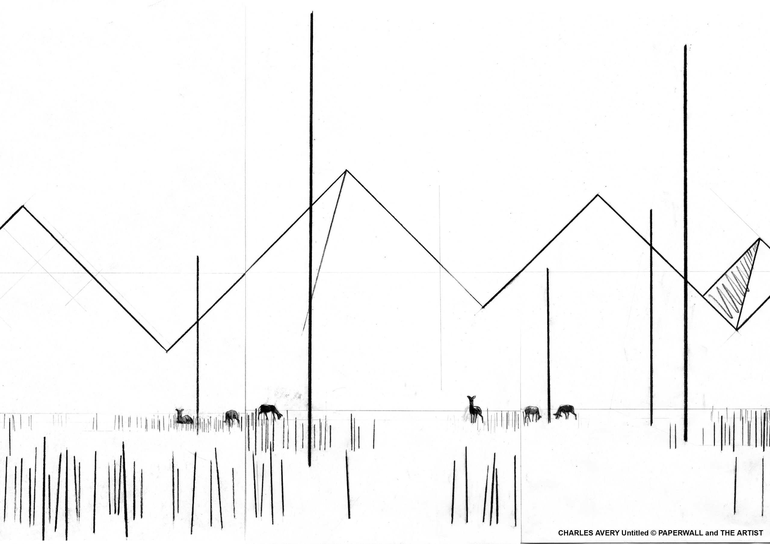

Charles Avery
Untitled
wallpaper in blueback paper
edition unlimited
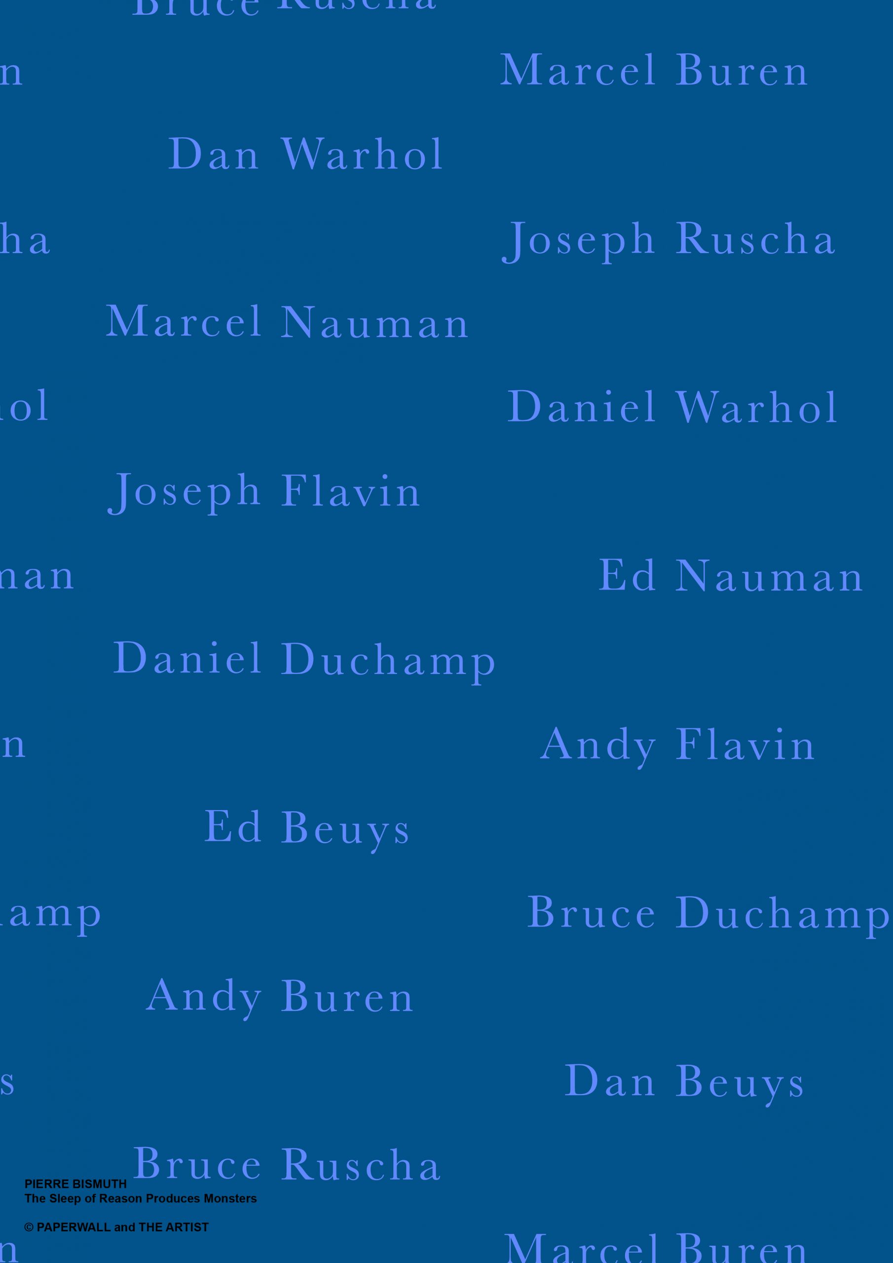
Pierre Bismuth
The Sleep of Reason Produces Monsters (blue)
wallpaper in blueback paper
edition unlimited
The Sleep of Reason Produces Monsters / Il Sonno della Ragione Produce Mostri
Pierre Bismuth uses artistic practice as a key to examine the perception of reality and, with humor, aims to destabilise predetermined codes of knowledge and to push the viewer to develop a criticism also towards things and objects whose meaning appears obvious. The artist captures the viewer, creating unexpected slips even where the sense is consolidated by daily use. Concentrated on the game that the signifier can produce, Pierre Bismuth seems to love misunderstanding. The Sleep of Reason Produces Monsters wallpaper, by means of a phase shift, does not match the surname of the artist mentioned with the name. The listed artists are perhaps the best known in the field of contemporary art, but, probably, the viewer does not immediately notice that the real surname does not correspond to the name. The game is revealed only upon careful reading. The Sleep of Reason Produces Monsters is a wallpaper that introduces the variation: the same motif is not repeated identical to itself because the combination of names chosen by the installer is different. There are multiple intersection possibilities and, each time, it is possible to embroider a different weaving. The design of this wallpaper highlights the uniqueness more closely, if you like, to the concept of a work of art. It is certainly an unprecedented approach that aims to emphasise the difference and variation with respect to a notion of repetitiveness of the same pattern, the way we are commonly used to image the design of the wallpaper.
Pierre Bismuth utilizza la pratica artistica come una chiave per esaminare la percezione della realtà e, con umorismo, mira a destabilizzare prefissati codici di conoscenza e a spingere lo spettatore a sviluppare una critica anche nei confronti di cose ed oggetti il cui significato appare ovvio. L’artista cattura lo spettatore, creando inattesi slittamenti anche laddove il senso è assodato da un uso quotidiano. Concentrato sul gioco che il significante può produrre, Pierre Bismuth sembra amare il malinteso. La carta da parati The Sleep of Reason Produces Monsters, mediante uno sfasamento, non fa corrispondere al nome il cognome dell’artista citato. Gli artisti elencati sono forse i più noti nel campo dell’arte contemporanea, ma, probabilmente, lo spettatore non si accorge immediatamente che al nome non corrisponde il vero cognome. Il gioco si rivela solo ad un’attenta lettura, in quanto la scrittura contribuisce ad una parvenza di normalità, quasi fosse una scelta decorativa. In effetti, la scrittura fa parte dell’immagine per la sua dimensione plastica e per quell’aspetto che la rende autonoma dalla significazione. E’ una carta da parati che introduce la variazione: un medesimo motivo non viene ripetuto identico a se stesso perché differente è la combinazione dei nomi scelta dall’installatore. Ci sono molteplici possibilità di intersezione e, ogni volta, è possibile ricamare una tessitura differente. Il disegno di questa carta da parati sottolinea maggiormente il carattere di unicità più simile, se si vuole, al concetto di opera d’arte. E’ sicuramente un’impostazione inedita che mira a porre l’accento sulla differenza e sulla variazione rispetto ad una nozione di ripetitività di uno stesso pattern, modalità con cui siamo comunemente abituati ad immaginare il disegno della carta da parati.
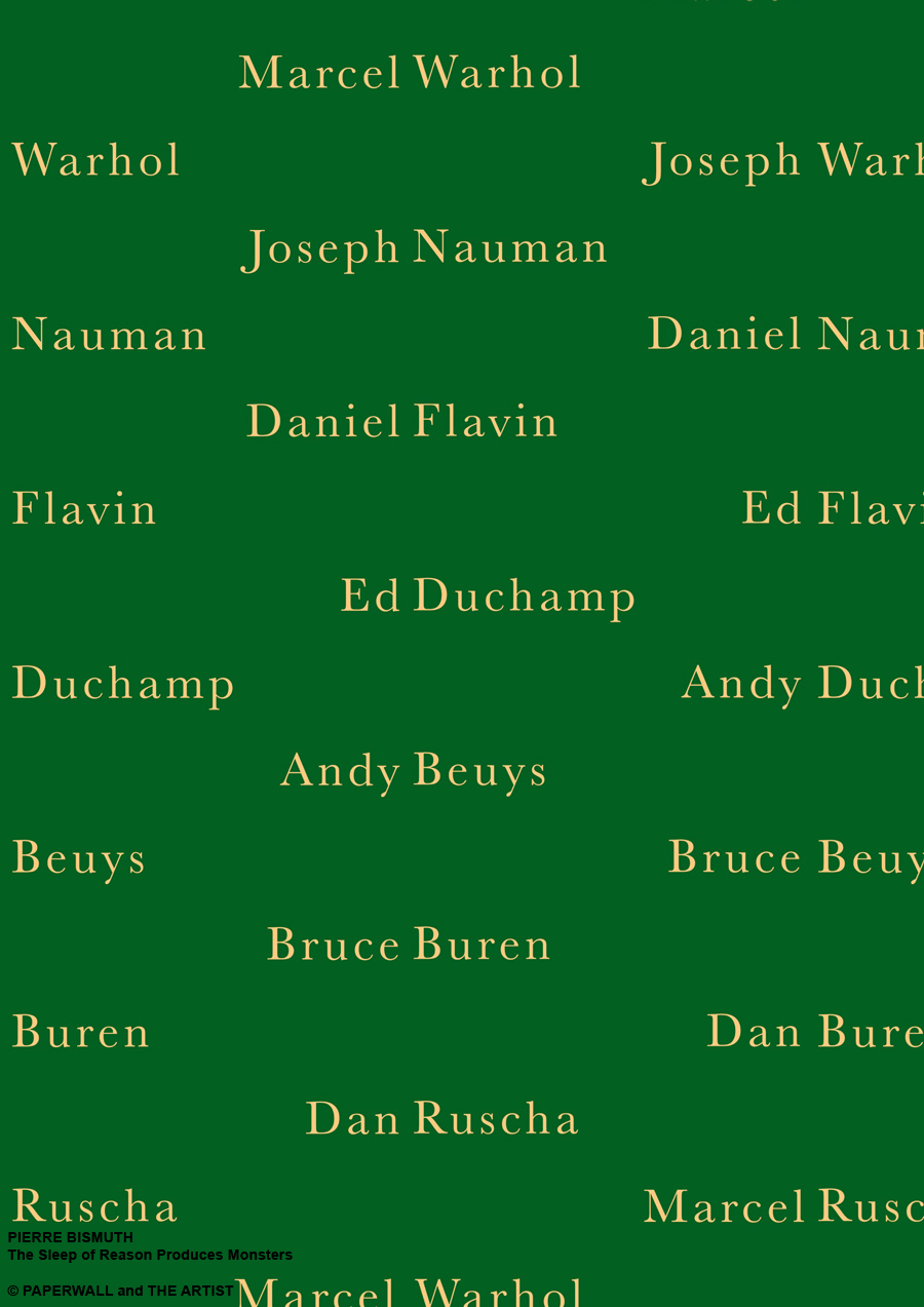
Pierre Bismuth
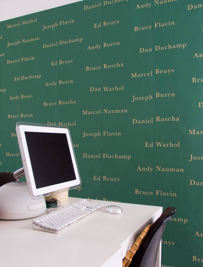
The Sleep of Reason Produces Monsters (green)
wallpaper in blueback paper
edition unlimited
The Sleep of Reason Produces Monsters / Il Sonno della Ragione Produce Mostri
Pierre Bismuth uses artistic practice as a key to examine the perception of reality and, with humor, aims to destabilise predetermined codes of knowledge and to push the viewer to develop a criticism also towards things and objects whose meaning appears obvious. The artist captures the viewer, creating unexpected slips even where the sense is consolidated by daily use. Concentrated on the game that the signifier can produce, Pierre Bismuth seems to love misunderstanding. The Sleep of Reason Produces Monsters wallpaper, by means of a phase shift, does not match the surname of the artist mentioned with the name. The listed artists are perhaps the best known in the field of contemporary art, but, probably, the viewer does not immediately notice that the real surname does not correspond to the name. The game is revealed only upon careful reading. The Sleep of Reason Produces Monsters is a wallpaper that introduces the variation: the same motif is not repeated identical to itself because the combination of names chosen by the installer is different. There are multiple intersection possibilities and, each time, it is possible to embroider a different weaving. The design of this wallpaper highlights the uniqueness more closely, if you like, to the concept of a work of art. It is certainly an unprecedented approach that aims to emphasise the difference and variation with respect to a notion of repetitiveness of the same pattern, the way we are commonly used to image the design of the wallpaper.
Pierre Bismuth utilizza la pratica artistica come una chiave per esaminare la percezione della realtà e, con umorismo, mira a destabilizzare prefissati codici di conoscenza e a spingere lo spettatore a sviluppare una critica anche nei confronti di cose ed oggetti il cui significato appare ovvio. L’artista cattura lo spettatore, creando inattesi slittamenti anche laddove il senso è assodato da un uso quotidiano. Concentrato sul gioco che il significante può produrre, Pierre Bismuth sembra amare il malinteso. La carta da parati The Sleep of Reason Produces Monsters, mediante uno sfasamento, non fa corrispondere al nome il cognome dell’artista citato. Gli artisti elencati sono forse i più noti nel campo dell’arte contemporanea, ma, probabilmente, lo spettatore non si accorge immediatamente che al nome non corrisponde il vero cognome. Il gioco si rivela solo ad un’attenta lettura, in quanto la scrittura contribuisce ad una parvenza di normalità, quasi fosse una scelta decorativa. In effetti, la scrittura fa parte dell’immagine per la sua dimensione plastica e per quell’aspetto che la rende autonoma dalla significazione. E’ una carta da parati che introduce la variazione: un medesimo motivo non viene ripetuto identico a se stesso perché differente è la combinazione dei nomi scelta dall’installatore. Ci sono molteplici possibilità di intersezione e, ogni volta, è possibile ricamare una tessitura differente. Il disegno di questa carta da parati sottolinea maggiormente il carattere di unicità più simile, se si vuole, al concetto di opera d’arte. E’ sicuramente un’impostazione inedita che mira a porre l’accento sulla differenza e sulla variazione rispetto ad una nozione di ripetitività di uno stesso pattern, modalità con cui siamo comunemente abituati ad immaginare il disegno della carta da parati.
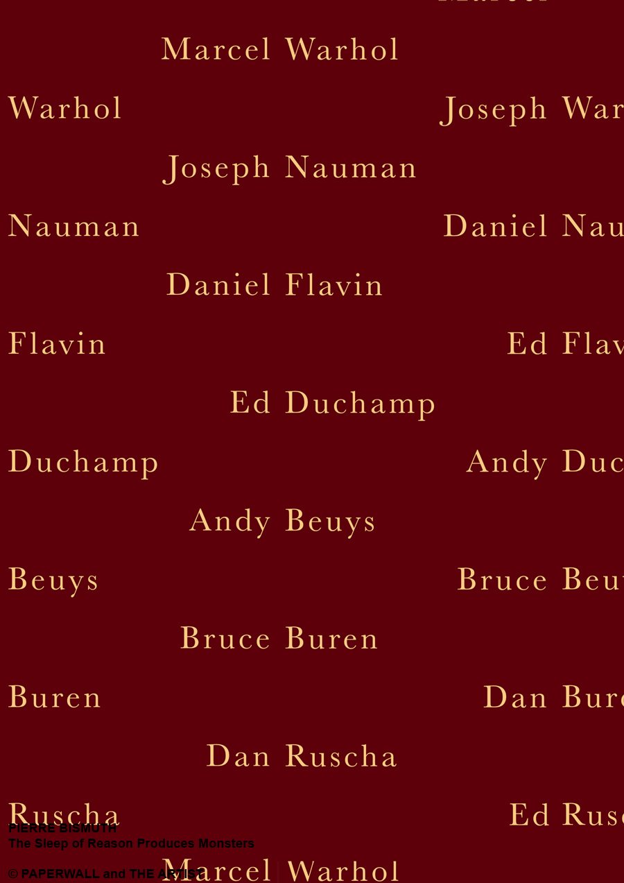
Pierre Bismuth
The Sleep of Reason Produces Monsters (blue)
wallpaper in blueback paper
edition unlimited
The Sleep of Reason Produces Monsters / Il Sonno della Ragione Produce Mostri
Pierre Bismuth uses artistic practice as a key to examine the perception of reality and, with humor, aims to destabilise predetermined codes of knowledge and to push the viewer to develop a criticism also towards things and objects whose meaning appears obvious. The artist captures the viewer, creating unexpected slips even where the sense is consolidated by daily use. Concentrated on the game that the signifier can produce, Pierre Bismuth seems to love misunderstanding. The Sleep of Reason Produces Monsters wallpaper, by means of a phase shift, does not match the surname of the artist mentioned with the name. The listed artists are perhaps the best known in the field of contemporary art, but, probably, the viewer does not immediately notice that the real surname does not correspond to the name. The game is revealed only upon careful reading. The Sleep of Reason Produces Monsters is a wallpaper that introduces the variation: the same motif is not repeated identical to itself because the combination of names chosen by the installer is different. There are multiple intersection possibilities and, each time, it is possible to embroider a different weaving. The design of this wallpaper highlights the uniqueness more closely, if you like, to the concept of a work of art. It is certainly an unprecedented approach that aims to emphasise the difference and variation with respect to a notion of repetitiveness of the same pattern, the way we are commonly used to image the design of the wallpaper.
Pierre Bismuth utilizza la pratica artistica come una chiave per esaminare la percezione della realtà e, con umorismo, mira a destabilizzare prefissati codici di conoscenza e a spingere lo spettatore a sviluppare una critica anche nei confronti di cose ed oggetti il cui significato appare ovvio. L’artista cattura lo spettatore, creando inattesi slittamenti anche laddove il senso è assodato da un uso quotidiano. Concentrato sul gioco che il significante può produrre, Pierre Bismuth sembra amare il malinteso. La carta da parati The Sleep of Reason Produces Monsters, mediante uno sfasamento, non fa corrispondere al nome il cognome dell’artista citato. Gli artisti elencati sono forse i più noti nel campo dell’arte contemporanea, ma, probabilmente, lo spettatore non si accorge immediatamente che al nome non corrisponde il vero cognome. Il gioco si rivela solo ad un’attenta lettura, in quanto la scrittura contribuisce ad una parvenza di normalità, quasi fosse una scelta decorativa. In effetti, la scrittura fa parte dell’immagine per la sua dimensione plastica e per quell’aspetto che la rende autonoma dalla significazione. E’ una carta da parati che introduce la variazione: un medesimo motivo non viene ripetuto identico a se stesso perché differente è la combinazione dei nomi scelta dall’installatore. Ci sono molteplici possibilità di intersezione e, ogni volta, è possibile ricamare una tessitura differente. Il disegno di questa carta da parati sottolinea maggiormente il carattere di unicità più simile, se si vuole, al concetto di opera d’arte. E’ sicuramente un’impostazione inedita che mira a porre l’accento sulla differenza e sulla variazione rispetto ad una nozione di ripetitività di uno stesso pattern, modalità con cui siamo comunemente abituati ad immaginare il disegno della carta da parati.
Pierre Bismuth
The Sleep of Reason Produces Monsters (green)
wallpaper in blueback paper
edition unlimited
installation view at Sonia Rosso Gallery, Torino
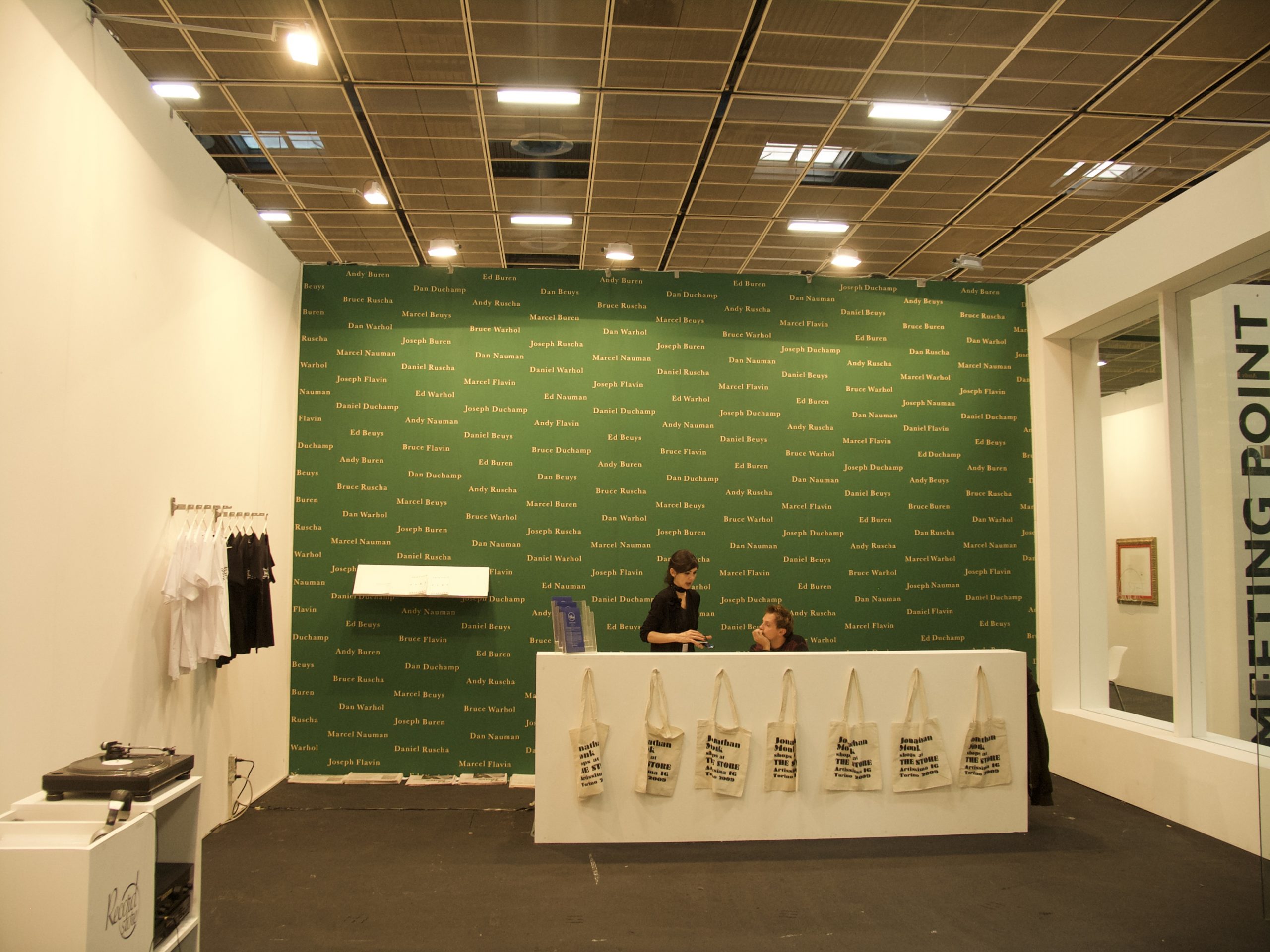
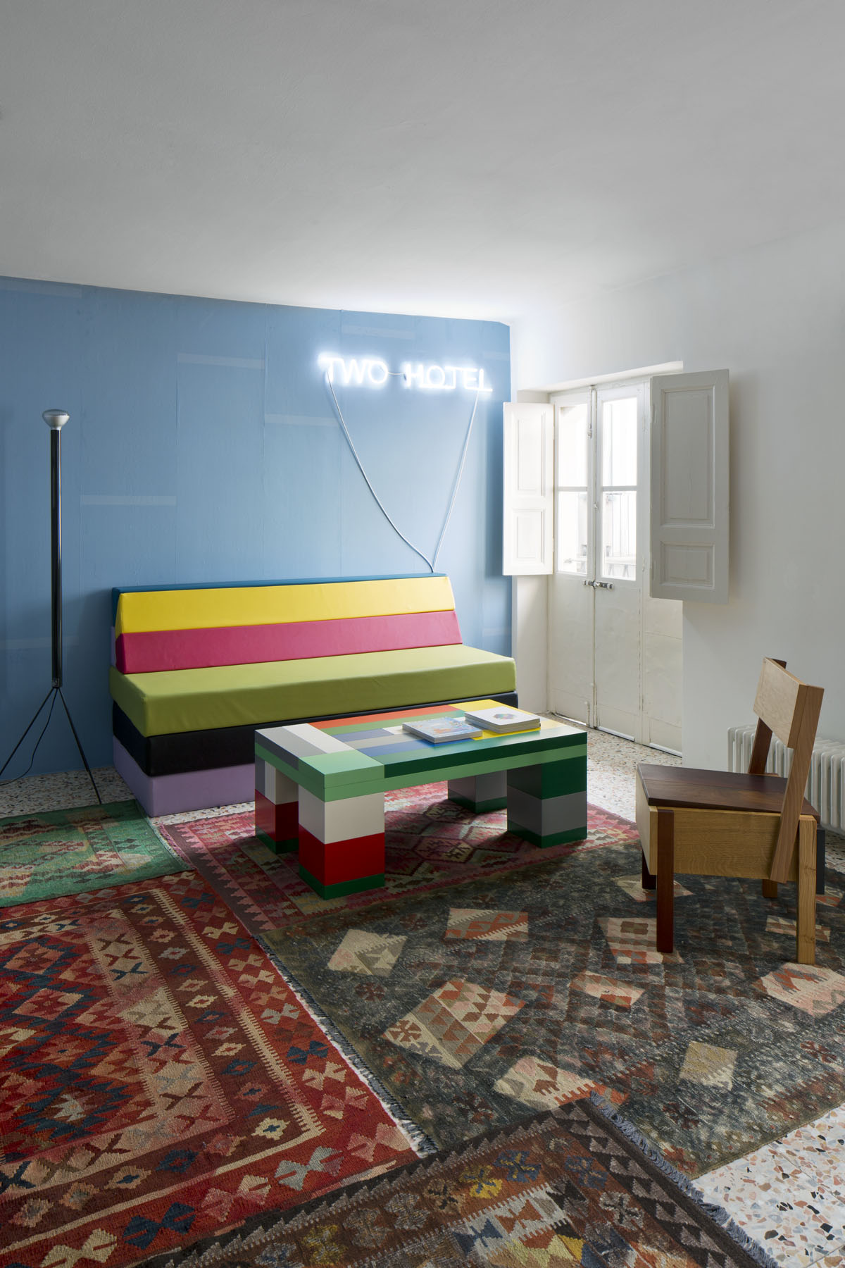
Pierre Bismuth
The Sleep of Reason Produces Monsters (green)
wallpaper in blueback paper
edition unlimited
intallation view at The Store, ARTISSIMA 16 Art Fair
November 2006
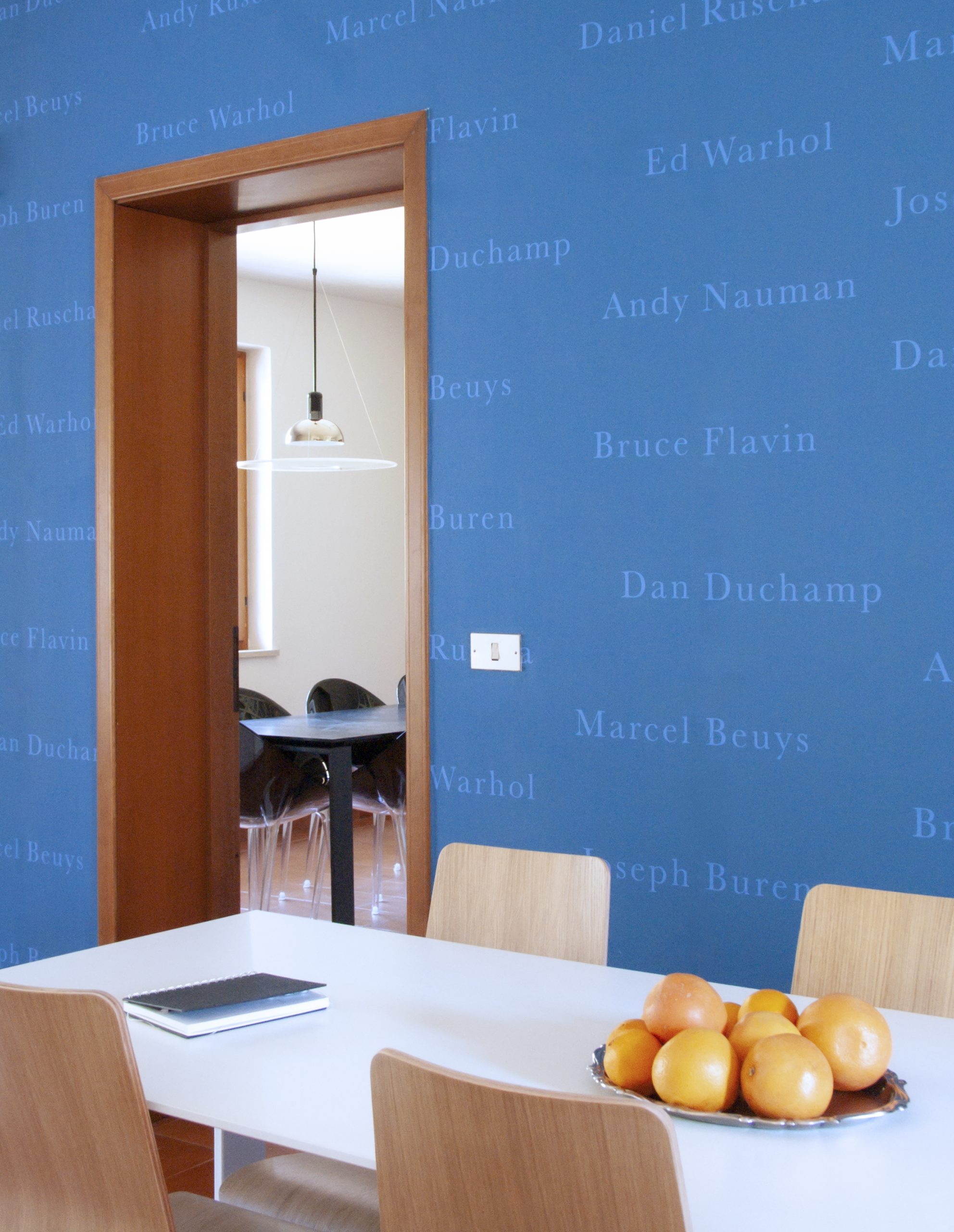
Pierre Bismuth
The Sleep of Reason Produces Monsters (blue)
wallpaper in blueback paper
edition unlimited
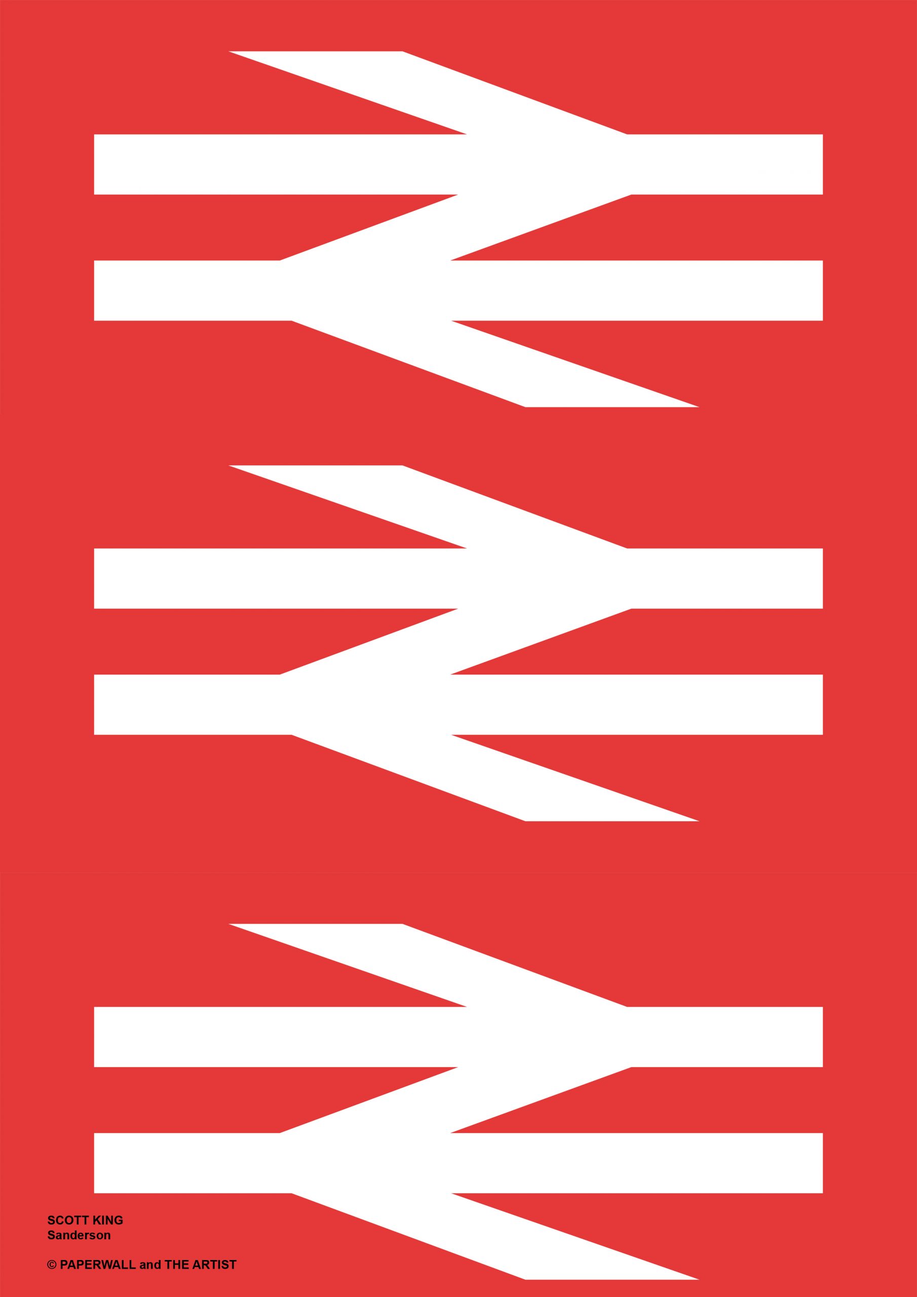
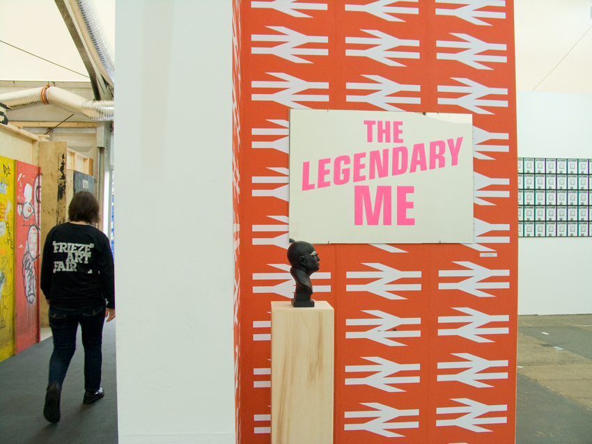
Scott King
Sanderson
wallpaper in blueback paper
edition unlimited
Scott King
Sanderson
wallpaper in blueback paper
edition unlimited
installation view at FRIEZE Art Fair
October 2008
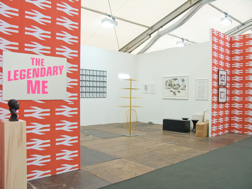
Scott King
Sanderson
wallpaper in blueback paper
edition unlimited
installation view at FRIEZE Art Fair
October 2008

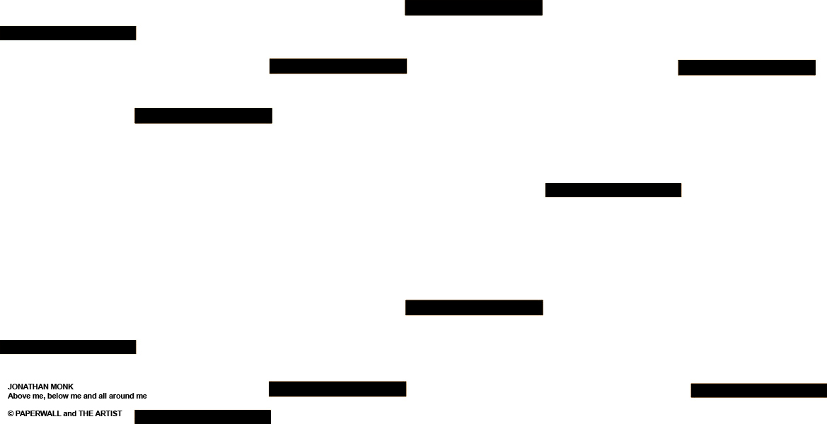
Jonathan Monk
Above me, below me and all around me (light blue/silver)
wallpaper in blueback paper
edition unlimited
Above me, below me and all around me / Sopra di me, sotto di me e tutto intorno a me
So simplified the wall paper idea into small rectangles. Each the width of a standard roll of wall paper and roughly 6 cm high. Each rectangle should be separated by exactly 177.5 cm of paper (my height). There should be no repeat and the appearance of rectangles will be determined by the height of the space in which it is to be papered (Jonathan Monk).
The wallpaper is available in different combinations of colours: light blue/silver, black/gold, green/red, black/white, brown/pink, black matt/black glossy.
Ho semplificato lʼidea della carta da parati in piccoli rettangoli. Ciascuno della larghezza standard di un rotolo e, approssimativamente, di 6 cm di altezza. La distanza tra i rettangoli dovrebbe essere di 177,5 cm (la mia altezza). Non dovrebbe esserci ripetizione e lʼapparizione dei rettangoli sarà determinata dallʼampiezza dello spazio in cui verrà installata la carta (Jonathan Monk).
La carta da parati viene prodotta in diverse combinazioni di colore: azzurro/argento, nero/oro, verde/rosso, nero/bianco, marrone/rosa, nero opaco/nero lucido.

Jonathan Monk
Above me, below me and all around me (black/gold)
wallpaper in blueback paper
edition unlimited
Above me, below me and all around me / Sopra di me, sotto di me e tutto intorno a me
So simplified the wall paper idea into small rectangles. Each the width of a standard roll of wall paper and roughly 6 cm high. Each rectangle should be separated by exactly 177.5 cm of paper (my height). There should be no repeat and the appearance of rectangles will be determined by the height of the space in which it is to be papered (Jonathan Monk).
The wallpaper is available in different combinations of colours: light blue/silver, black/gold, green/red, black/white, brown/pink, black matt/black glossy.
Ho semplificato lʼidea della carta da parati in piccoli rettangoli. Ciascuno della larghezza standard di un rotolo e, approssimativamente, di 6 cm di altezza. La distanza tra i rettangoli dovrebbe essere di 177,5 cm (la mia altezza). Non dovrebbe esserci ripetizione e lʼapparizione dei rettangoli sarà determinata dallʼampiezza dello spazio in cui verrà installata la carta (Jonathan Monk).
La carta da parati viene prodotta in diverse combinazioni di colore: azzurro/argento, nero/oro, verde/rosso, nero/bianco, marrone/rosa, nero opaco/nero lucido.

Jonathan Monk
Above me, below me and all around me (light green/red)
wallpaper in blueback paper
edition unlimited
Above me, below me and all around me / Sopra di me, sotto di me e tutto intorno a me
So simplified the wall paper idea into small rectangles. Each the width of a standard roll of wall paper and roughly 6 cm high. Each rectangle should be separated by exactly 177.5 cm of paper (my height). There should be no repeat and the appearance of rectangles will be determined by the height of the space in which it is to be papered (Jonathan Monk).
The wallpaper is available in different combinations of colours: light blue/silver, black/gold, green/red, black/white, brown/pink, black matt/black glossy.
Ho semplificato lʼidea della carta da parati in piccoli rettangoli. Ciascuno della larghezza standard di un rotolo e, approssimativamente, di 6 cm di altezza. La distanza tra i rettangoli dovrebbe essere di 177,5 cm (la mia altezza). Non dovrebbe esserci ripetizione e lʼapparizione dei rettangoli sarà determinata dallʼampiezza dello spazio in cui verrà installata la carta (Jonathan Monk).
La carta da parati viene prodotta in diverse combinazioni di colore: azzurro/argento, nero/oro, verde/rosso, nero/bianco, marrone/rosa, nero opaco/nero lucido.
Jonathan Monk
Above me, below me and all around me (white/black)
wallpaper in blueback paper
edition unlimited
Above me, below me and all around me / Sopra di me, sotto di me e tutto intorno a me
So simplified the wall paper idea into small rectangles. Each the width of a standard roll of wall paper and roughly 6 cm high. Each rectangle should be separated by exactly 177.5 cm of paper (my height). There should be no repeat and the appearance of rectangles will be determined by the height of the space in which it is to be papered (Jonathan Monk).
The wallpaper is available in different combinations of colours: light blue/silver, black/gold, green/red, black/white, brown/pink, black matt/black glossy.
Ho semplificato lʼidea della carta da parati in piccoli rettangoli. Ciascuno della larghezza standard di un rotolo e, approssimativamente, di 6 cm di altezza. La distanza tra i rettangoli dovrebbe essere di 177,5 cm (la mia altezza). Non dovrebbe esserci ripetizione e lʼapparizione dei rettangoli sarà determinata dallʼampiezza dello spazio in cui verrà installata la carta (Jonathan Monk).
La carta da parati viene prodotta in diverse combinazioni di colore: azzurro/argento, nero/oro, verde/rosso, nero/bianco, marrone/rosa, nero opaco/nero lucido.
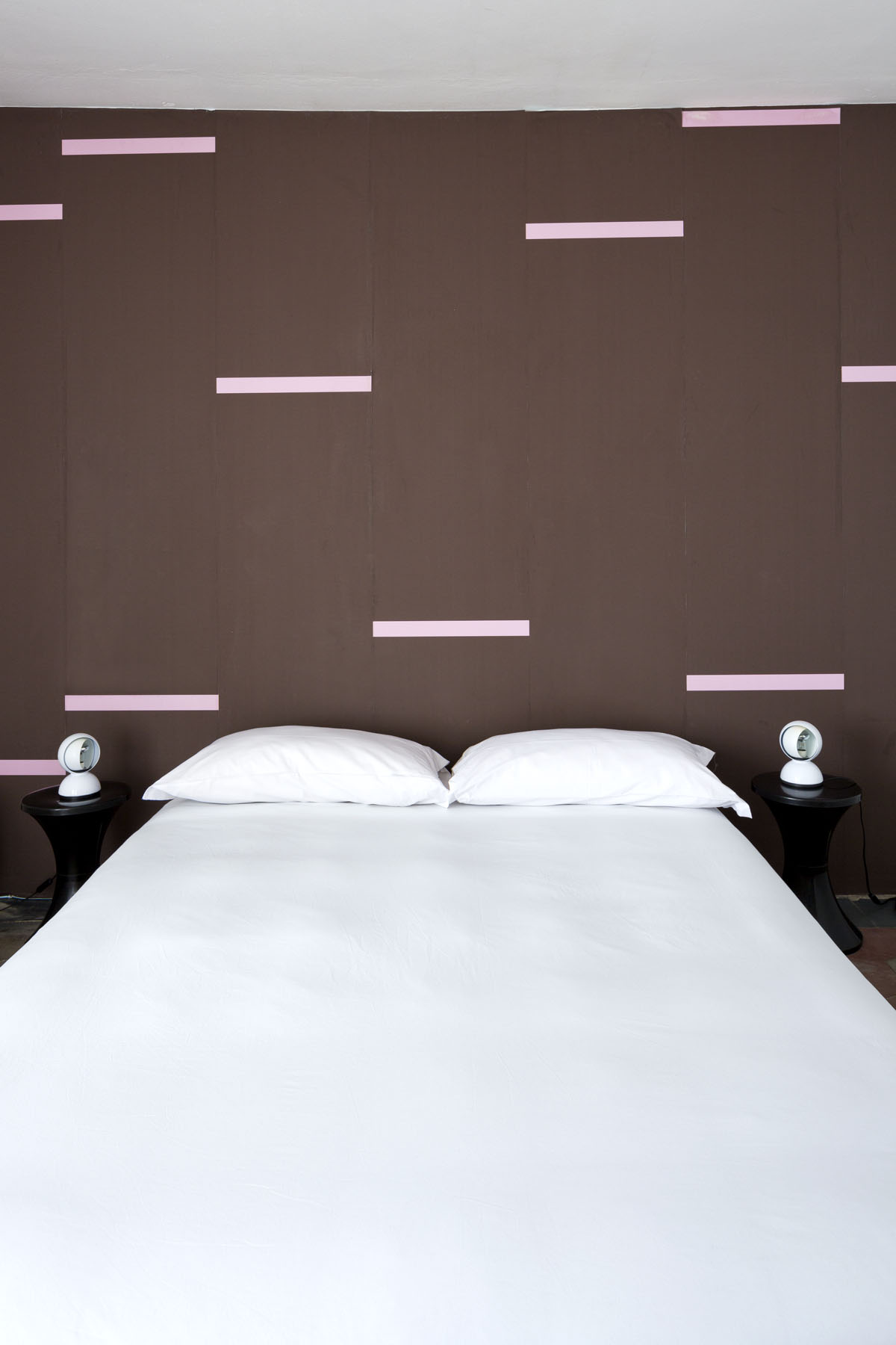
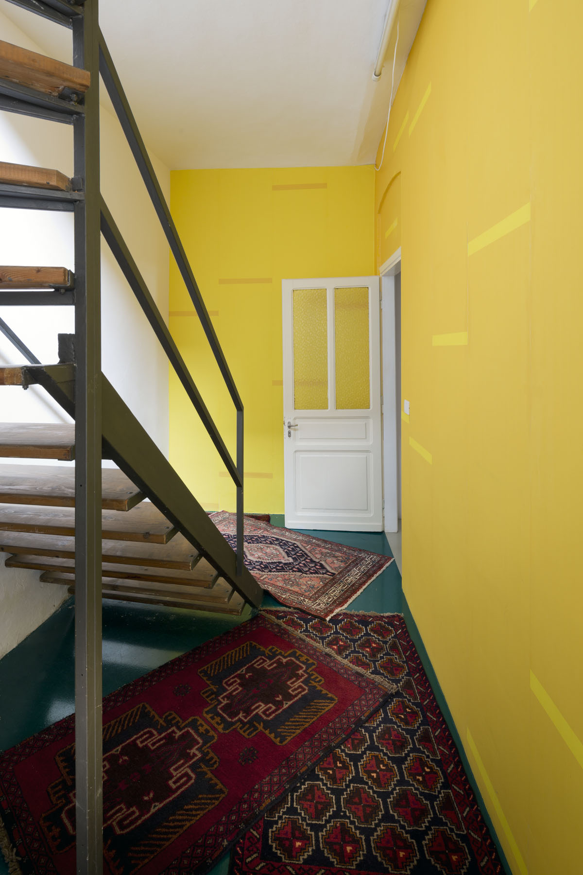
Jonathan Monk
Above me, below me and all around me (brown/pink)
wallpaper in blueback paper
edition unlimited
installation view at PROGETTO LIRA HOTEL, Torino
photo courtsy of Filippo Bamberghi
Jonathan Monk
Above me, below me and all around me
wallpaper in blueback paper
edition unlimited
installation view at PROGETTO LIRA HOTEL, Torino
photo courtesy of Filippo Bamberghi
Jonathan Monk
Above me, below me and all around me
wallpaper in blueback paper
edition unlimited
installation view at PROGETTO LIRA HOTEL, Torino
photo courtesy of Filippo Bamberghi
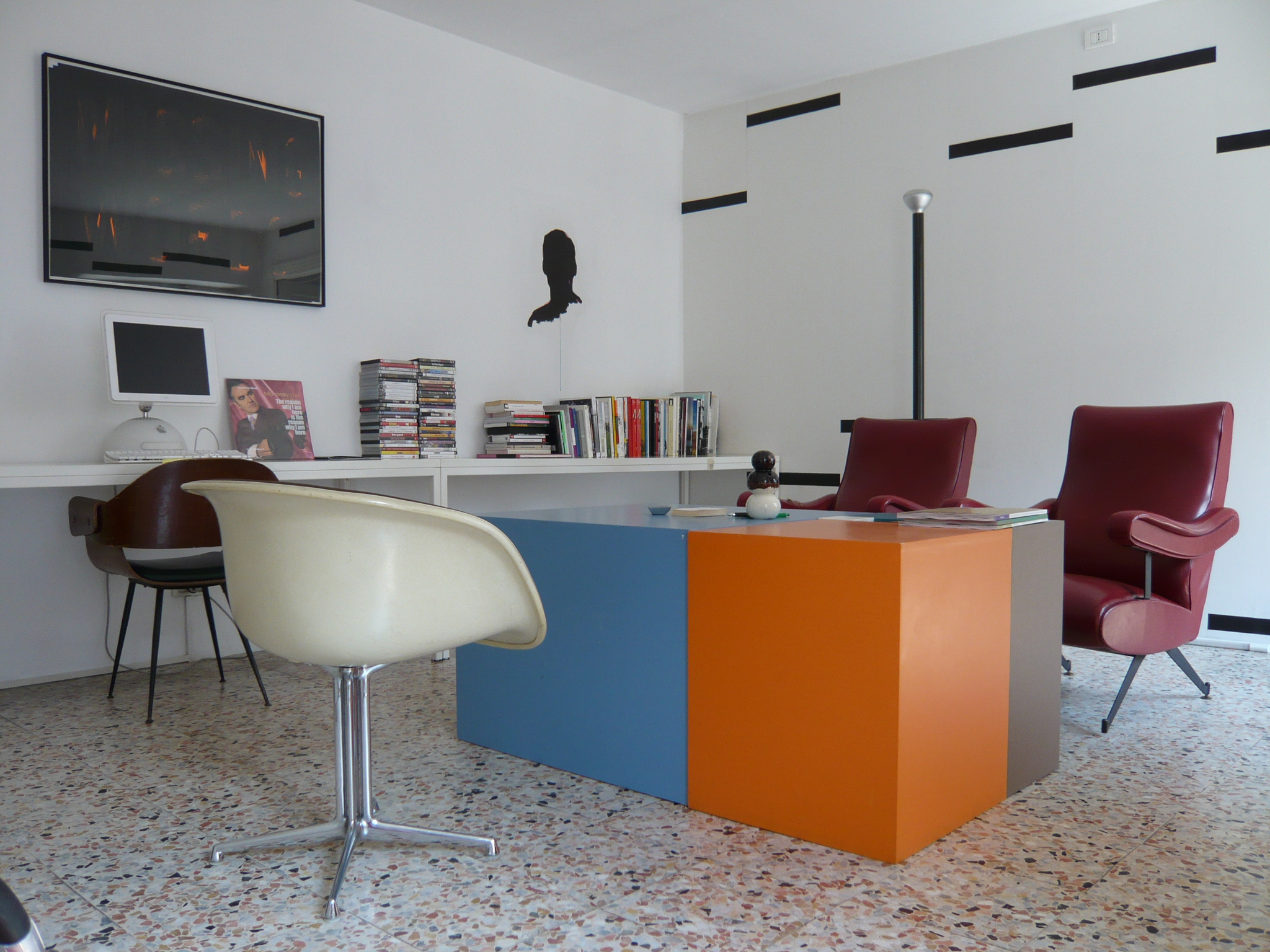
Jonathan Monk
Above me, below me and all around me
wallpaper in blueback paper
edition unlimited
installation view at LIRA HOTEL, Torino